lunes, 4 de julio de 2011

High Park | Rojkind Arquitectos | Arquitectura 3d

High Park by Rojkind Arquitectos
Construction of this apartment block with a stepped elevation
by Mexican firm Rojkind
Arquitectos
is due to commence this summer in Monterrey,
Mexico.
High Park by Rojkind Arquitectos
The ground and first floors of High Park will accommodate
shops with eight storeys of apartments stepping backwards and
forwards above.
High Park by Rojkind Arquitectos
The setbacks will create both sheltered and open terraces for
residents with views towards the mountains.
High Park by Rojkind Arquitectos
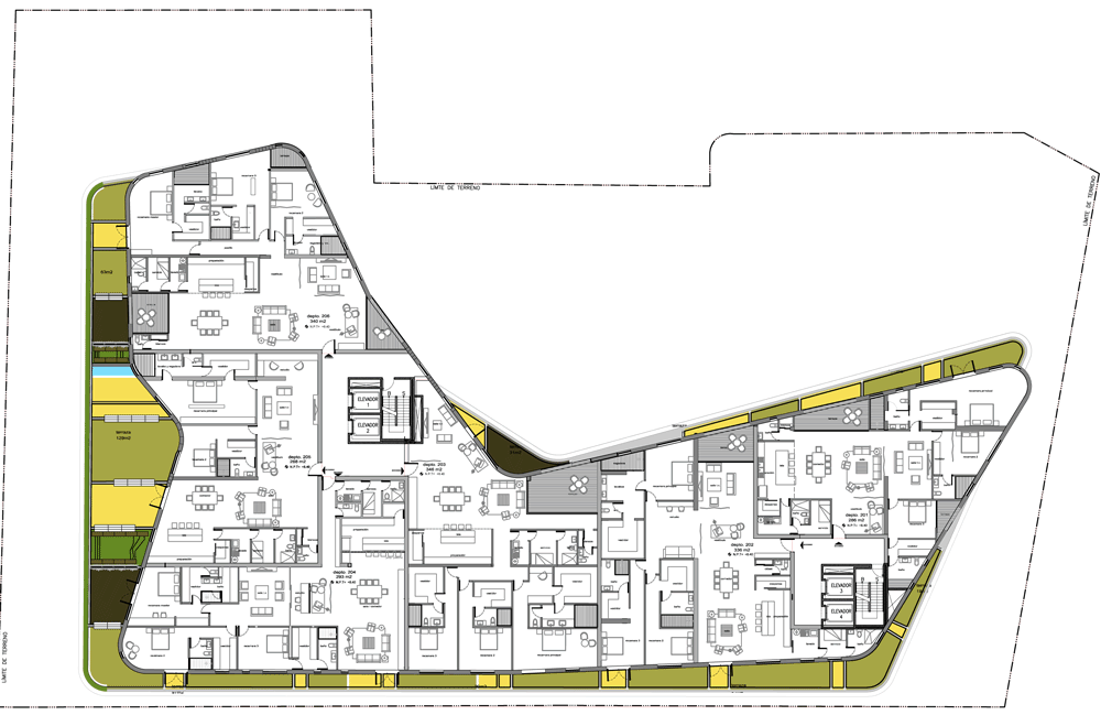
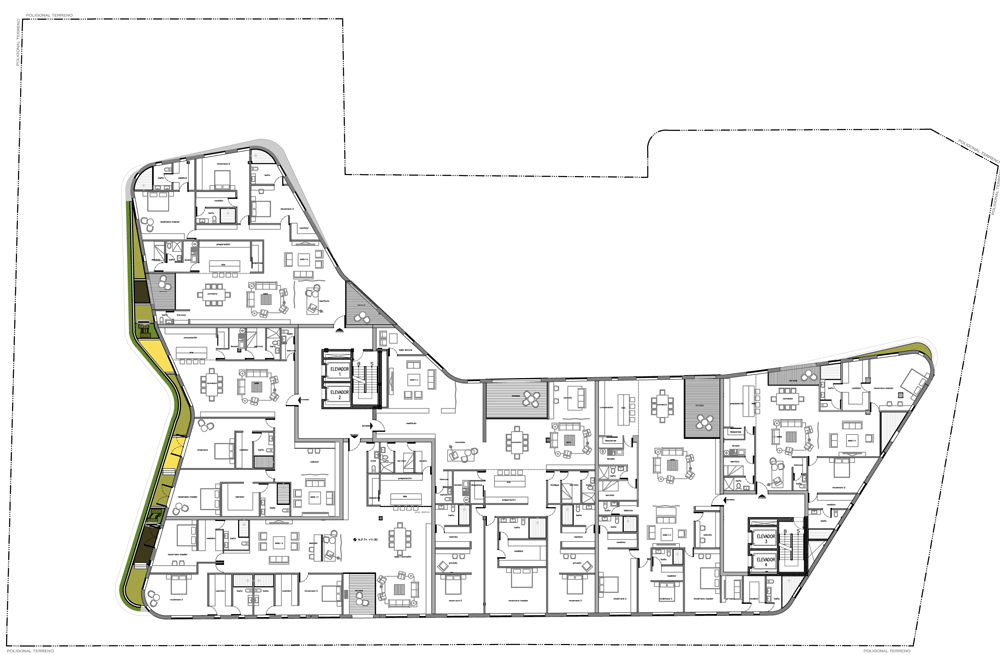
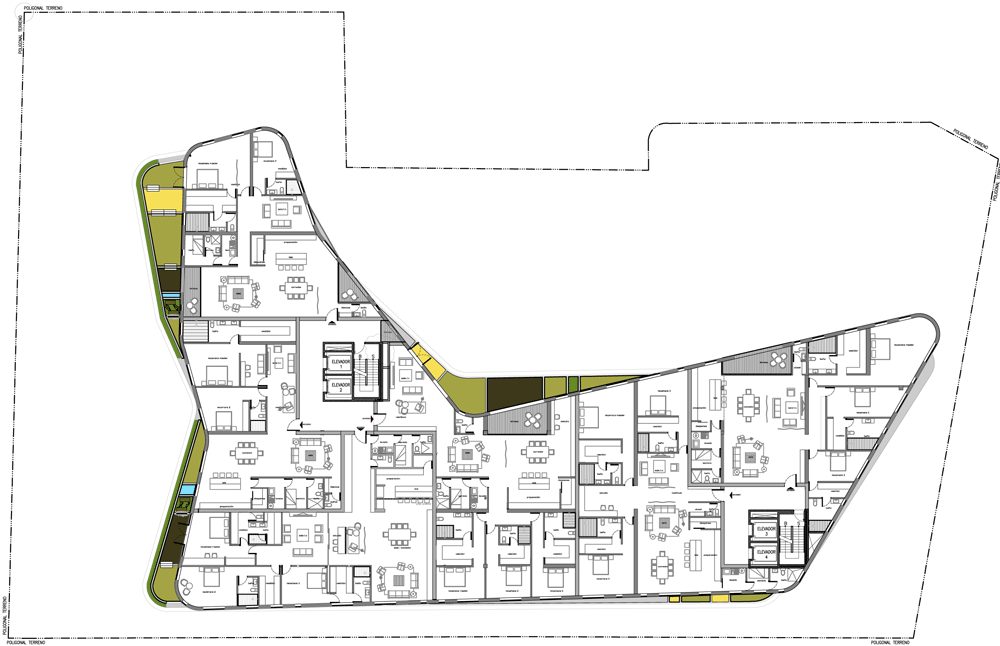
Each of the 32 apartment interiors have been designed by one
of six different local designers, creating a varied layout for
each one.
High Park by Rojkind Arquitectos
A car park will be located across four storeys below ground.
High Park by Rojkind Arquitectos

More projects by Rojkind Arquitectos on Dezeen »

High Park by Rojkind Arquitectos

More stories about projects in Mexico on Dezeen »


Here is some more information from Rojkind Arquitectos:

High Park is located on the outskirts of the northern city of
Monterrey, Mexico. Surrounded by the Majestic Sierra Madre
Oriental Range.
High Park by Rojkind Arquitectos
The project is designed to take full advantage of its
geographic location and to help mitigate the extreme climatic
conditions.

High Park by Rojkind Arquitectos

Click above for larger image
As a recurring design concern for rojkind arquitectos and as
a way of integrating the building into the pedestrian realm (giving
back to the community), the building steps back to create an
outdoor shaded space that can be enjoyed by the residents and
visitors alike.

High Park by Rojkind Arquitectos

Click above for larger image
“Normally these types of building don’t allow for the
creation of any public space, the entire site is developed with
the intention of maximizing the most square footage for it’s
commercial interest. This project takes a different approach by
allowing its site not to be built in its entirely and provide
public space that can be utilize by anyone” Gerardo Salinas,
partner, rojkind arquitectos
High Park by Rojkind Arquitectos

Click above for larger image
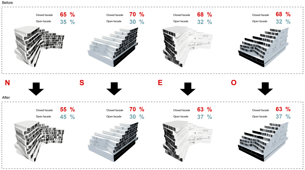
To counterbalance the strong sun, the floor plates shift in
relation to one another creating a play of light and shadow, and
the use of local stone, done by local craftsmen on the facade
allows the building to stay cooler and makes its appearance
change as the sun moves across the horizon.

High Park by Rojkind Arquitectos

Click above for larger image
The project offers outdoor terraces for each apartment due to
the strict setback restrictions of the site, capitalizing on the
views of the adjacent mountains.
High Park by Rojkind Arquitectos

Click above for larger image
“People enjoy the convenience of a house for its connection
to a garden, or exterior spaces, which normally apartments lack.
By having a project which integrates, not only terraces but real
gardens even at the upper levels, we have achieved an experience
unique to Monterrey.” Michel Rojkind, founding partner
High Park by Rojkind Arquitectos

Click above for larger image
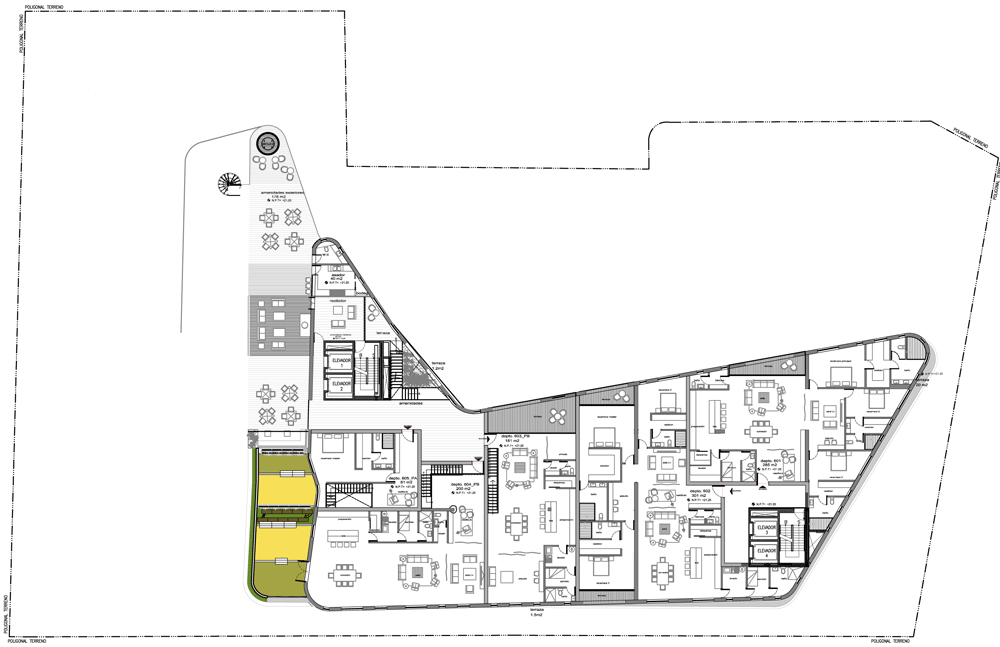
High Park consists of a total of ten levels above grade and
three and a half levels of underground parking.
High Park by Rojkind Arquitectos

Click above for larger image
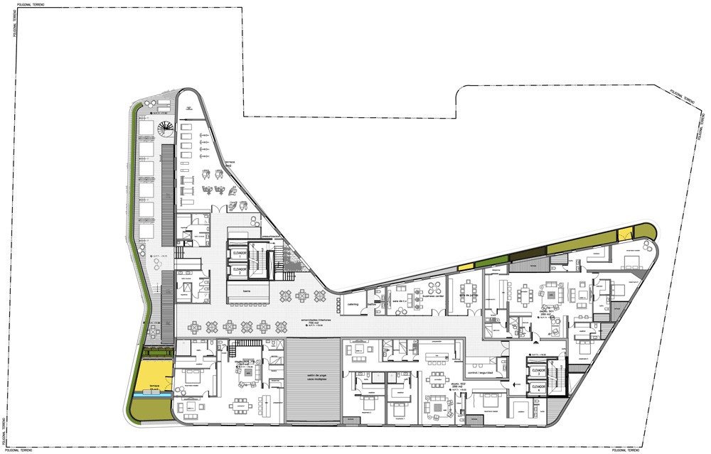
The first two levels are for commercial retail, the remaining
8 levels for luxury apartments. Within these 8 residential
levels, recreational and entertainment spaces will be provided
for the residents including a pool, gym, spa, etc.
High Park by Rojkind Arquitectos

Click above for larger image
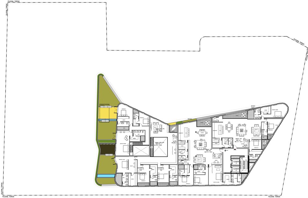
These 32 apartments will range in size from 250 square meters
to 650 square meters.
High Park by Rojkind Arquitectos

Click above for larger image
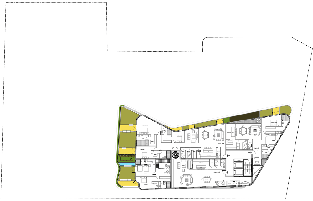
The Building as a Platform for Additional Creative Input
Six local designers have been invited to make each apartment
unique and appealing to different styles and different market
segments.
High Park by Rojkind Arquitectos

Click above for larger image
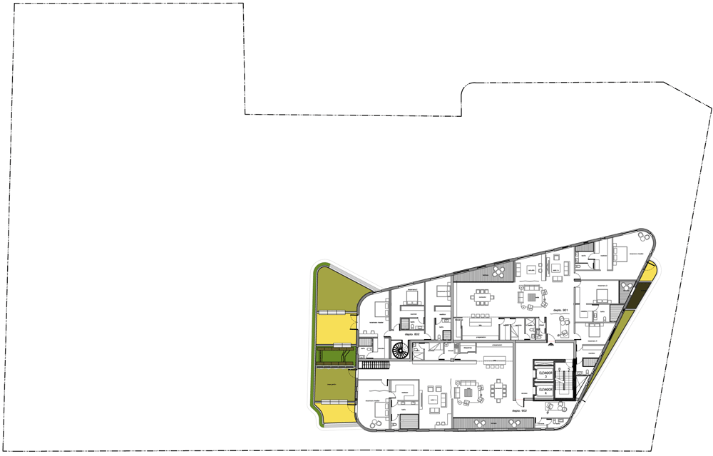
Each apartment has a different layout and configuration,
offering a wide range of internal distributions from a one level
apartment to a two-story apartment.
High Park by Rojkind Arquitectos

Click above for larger image
Construction will begin this summer.
High Park by Rojkind Arquitectos

Click above for larger image

viernes, 1 de julio de 2011

SFMOMA Expansion | Snøhetta | Arquitectura 3d

SFMOMA Expansion by Snohetta
Norwegian architects Snøhetta have unveiled their design for an extension to the
San Francisco Museum of Modern Art (SFMOMA), which will double the gallery’s
exhibition and education spaces.
SFMOMA Expansion by Snohetta
A glass-fronted gallery along Howard Street will create a new
entrance to the museum on a part of the site currently occupied
by a fire station.
SFMOMA Expansion by Snohetta
From here a five metre-wide pathway will lead up a set of
stairs and across a public square towards Natoma Street.
SFMOMA Expansion by Snohetta
The new buildings will be over 15 metres taller than the existing SFMOMA
building, which was completed by architect Mario Botta in 1995.
SFMOMA Expansion by Snohetta

martes, 14 de junio de 2011

Alphabet Building | MVRDV | Arquitectura 3d

Alphabet Building by MVRDV
Dutch architects
MVRDV
have designed this creative industries office block in
Amsterdam that has letters of the alphabet cut out of the facade.
Alphabet Building by MVRDV
Each cut-out is the window to an office unit and each letter
signifies the address extension for the occupying business.
Alphabet Building by MVRDV
On the east facade of the Alphabet Building a series of
dotted windows spell out the number 52, relating to the address.
Alphabet Building by MVRDV
All letters of the alphabet have been used apart from I and
Q. The original design included Q (as shown in top image) but
was later replaced by Z .
Alphabet Building by MVRDV
The project is scheduled for completion in 2012.
Alphabet Building by MVRDV

More projects by MVRDV on Dezeen »

The following details are from MVRDV:
Alphabet Building Amsterdam
MVRDV designs creative industry hub
Amsterdam based project development corporation NIC started
sale of the MVRDV designed Alphabet building. In Amsterdam small
and mid-size creative companies have trouble finding suitable
office space. The Alphabet building communicates through a clear
exterior design which reveals on the East façade the house
number and at the main façade its extension for each company, a
letter of the alphabet. The interior is highly flexible and
completed with a rough and pure finishing. The 3200m2 creative
industry building will be completed in 2012 according to high
energy efficiency standards.
Alphabet Building by MVRDV
  • On the East facade the house number, on the front facade
    its extension.
The creative industry has seemingly unrealistic demands when
it comes to office locations: a incubator of creative ideas
which is spacious and inspiring with a differentiating design at
a great location with car access. The Alphabet building in the
Amsterdam port refurbishment Minervahaven unites all these
qualities. The former port is currently refurbished to become a
creative hub.
Alphabet Building by MVRDV
  • Behind each letter is a flexible office unit
The building is on a relatively small site of 30 x 30 meters
and consists of a transparent plinth with a compact office block
on top. Behind each letter of the façade the building offers a
flexible unit of 128m2, the units can be sold independently or
as a series of letters. Design studio Thonik will occupy the top
floor or the letters A to F. As it was impossible to put the
entire alphabet on the façade the letters I and Q are missing:
the IQ is inside the building.
Alphabet Building by MVRDV
  • Interior finishings are concrete, aluminium and steel
The interior finishing follows the demand of creative
companies, large loft like spaces with a rough finishing: no
double ceilings, exposed materials such as concrete, aluminium
and steel. A number of sustainable technologies give the
building an excellent energy profile. Parking is located inside
the plinth, circulation and spacious outside areas at the back
of the building.

domingo, 12 de junio de 2011

Cultural Complex Longgang District | Mecanoo | Arquitectura 3d

Shenzhen Cultural Centre by Mecanoo
Dutch architects Mecanoo
have won a competition to design a cultural centre in Shenzhen
with this design composed of a row of overhanging red volumes.
Shenzhen Cultural Centre by Mecanoo
The volumes create arches above routes from a new public
square to the business district beyond.
Shenzhen Cultural Centre by Mecanoo
The Cultural Complex Longgang District will contain a public
art museum, a science museum, a youth centre and a bookshop.
Shenzhen Cultural Centre by Mecanoo
Visualisations are by
Doug and
Wolf
.
Shenzhen Cultural Centre by Mecanoo

More projects in Shenzhen on Dezeen »

Shenzhen Cultural Centre by Mecanoo
Here are some more details from the architects:
Cultural Complex Longgang District

Shenzhen, China
Mecanoo designed the winning competition entry for a new
83,500 m2 cultural complex with a public art museum, science
museum, youth centre and a bookshop, public square and parking
in the Shenzhen district. The new cultural and commercial
complex will provide the district with its own landmark and
destination and transform the existing Longcheng park into a
lively destination point. It will form a dynamic link between
the commercial business district, a formal park and gardens and
one of the district’s main thoroughfares. The new museum complex
will unify the evolving urban fabric and generate a vibrant
downtown.
urban connector

Connecting the cultural complex with the surrounding areas and
new residential development was the key consideration for the
design. The linearity of the existing urban masterplan created a
barrier between the western development area and Longcheng park,
further cutting up the area and contributing to its lack of
urban vitality. Longcheng park will become a lively square which
will further strengthen the quarter’s identity and provide
residents and visitors with a much needed sense of place.
arches

Four building volumes emerge from the ground to create a series
of arches and sheltered public event spaces which frame the
central square. Rounded shapes respect the natural flow of
pedestrians through the site. These open arches serve as filters,
attractors and reference points and allow the building
programmes to expand outside while formally symbolising openness
and connection. Different programmes strategically located on
the ground floor open outwards into the exterior public space
including the city in the exhibition. From within the building
interior, two bridges will link to the commercial plinths of the
new residential area. Cultural and commercial programmes are
linked to contribute to an urban symbiosis.
programme

Cultural complex of 83,500 m2 with public art museum, science
museum, youth centre and a bookshop and 22,500 m2 of underground
parking and a new public square totalling 7 hectares. Invited
design competition, 1st place.

U.S. Embassy in London | Morphosis | Arquitectura 3d

New U.S. Embassy in London


Location: London, United Kingdom
Client: United States State Department
Site Area:4.9 acres / 2.0 hectares
Size:430,557 gross sq ft / 39,999 gross sq m
Program: A consular section including a Grand Hall; a diplomatic area with Glass Dome, Gallery, Multi-purpose room and Main Lobby; and an administrative section with offices, conference rooms, cafeteria, terraces, recreation center and retail. The landscape design presents two new significant public plazas, a consular garden, and a formal courtyard, as well as multiple security measures to safeguard the building and its grounds.
Design:2009 - 2010
Type:Governmental


Project Credits: Morphosis Team
Design Director: Thom Mayne
Principal & Project Manager: Kim Groves
Lead Designer: Chandler Ahrens
Project Designer: Graham Ferrier Elizabeth Wendell
Project Team: Jon Cummings Josh Sprinkling John Carpenter


martes, 22 de febrero de 2011

Strusshamn | Eriksen Skajaa Architects | Arquitectura 3d


Norwegian design team, Eriksen Skajaa Architects urban study for the redevelopment of a former industrial site in Strusshamn, a Norwegian coastal settlement.


Strusshamn is a settlement on the southwest side of Askøy, an island outside of Bergen on the west coast of Norway, with strong ties to the ocean. The fjord was used forntransport due to lack of roads and it was an important economic resource. When this changed and the car became the most important way of communication two centers developed without a clear connection to each other.


The site in Strusshamn is a former boat building factory for Viksund Boats that was bought by the municipality to make a new zoning plan to avoid heavy industry to be established in the future in the old, preserved harbour environment. In our study we are looking for a way to connect the two parts of Strusshamn.

By simple means like improving and defining different surfaces, re-establishing a hidden river, and introducing public spaces of different character we redefine Strusshamn and prepare for the integration of the new development at the Viksund site.

The study examines three different combinations of density and program on the site, but with a similar layout and approach to the site. The layout is based on analysis of climate and landscape with an aim to create good public spaces and buildings with access to light and the spectacular view the landscape offers. A continuous public space with piers, public spaces, a promenade and backyards attach the new development to the rest of Strusshamn.

A central canal on the site connects the two parts of the site together and increases the quality of both and this way not only the houses on the waterfront have access to the qualities of the harbor environment.

Towards the fjord to the south lies a large public space for the whole of Strusshamn.The new development is based on the historical buildings in Strusshamn.

Small volumes that sometimes grow together and create larger units characterize the historical buildings. The buildings are close to the water and create spaces between that vary in size and quality. With those aspects in mind, the new development is a continuation and extension of the historical place, while at the same time demonstrating the possibilities of developing these kinds of sites into areas with more dense or urban structures.


Site Plan Key:

1. Pond
2. Island with duck house
3. Entrance to parking
4. Guest parking
5. Terrain down to sea level
6. Culture ”Boathouse”
7. Water element (Fountain)
8. Canal
9. Bridge
10. Public space on pier
11. Bench
12. Court yard
13. Guest pier
14. House
15. Water element (gutter)
16. Public space
17. Stairs to the sea level
18. House on top of parking base
19. Terrace
20. Vegetable garden
21. Nature park
22. Sculpture park
23. WC and changing rooms for the beach
24. BeachSite Plan Key:

1. Pond
2. Island with duck house
3. Entrance to parking
4. Guest parking
5. Terrain down to sea level
6. Culture ”Boathouse”
7. Water element (Fountain)
8. Canal
9. Bridge
10. Public space on pier
11. Bench
12. Court yard
13. Guest pier
14. House
15. Water element (gutter)
16. Public space
17. Stairs to the sea level
18. House on top of parking base
19. Terrace
20. Vegetable garden
21. Nature park
22. Sculpture park
23. WC and changing rooms for the beach
24. Beach